Negative space is blank space creating its own image from the outline of the object that defines it. A key factor of negative space is to allow the viewer to appreciate the design effortlessly. Great negative space will entice the viewer to spend extra time looking at a design which may give an advantage over other competitors.
When negative space is applied in design it is usually very simple but can be perceived as very complex and intelligent. Negative space designs are more rewarding for the viewer as they can feel a sense of achievement from discovering the hidden message.
A logo that is able to harness the ability to share itself with negative space is one that can go the distance. Its unique take on that particular subject can stick in the mind of a viewer, they can appreciate the meticulous work which has gone into the design to be able deliver a message, or two, in the case of many of negative space logos.
Please view my top 10 negative space logos below and see if you can find their hidden message.
1.FedEx
2. Bat Bar
3. Circus of Magazines
4.Elefont
5.Flight Finder
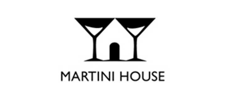
6. Martini House
7. The Bronx Zoo
8. Yoga Australia
9. Spartan Golf Club
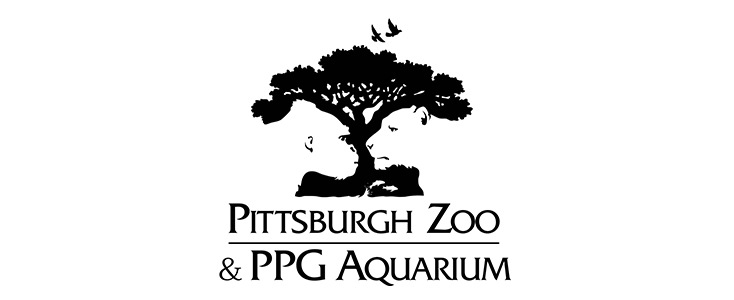
10. Pittsburgh Zoo & PPG Aquarium
